本文實例講述了Android開發(fā)圓角Button按鈕實現(xiàn)過程,分享給大家供大家參考,具體內(nèi)容如下
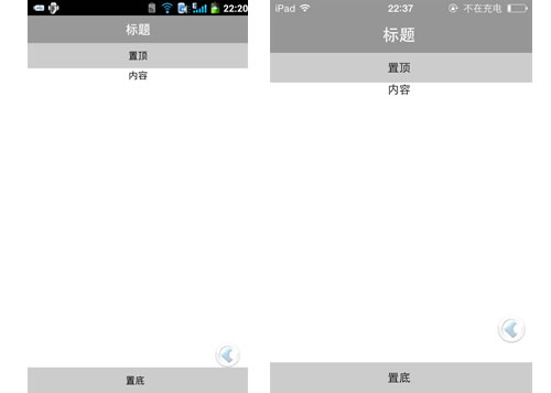
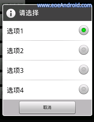
需求及效果圖:

實現(xiàn)思路:
1、shape實現(xiàn)圓角
在drawable新建兩個xml 文件, 這兩個 xml文件用shape 實現(xiàn)了圓角效果。
Note:
因為要讓用戶有按下去的效果體驗, 所有要有兩套圓角圖, 在按下去時候切換
<!-- res/drawable/button_shape_normal.xml --><shape xmlns:android="http://schemas.android.com/apk/res/android" android:shape="rectangle" > <!-- rounded corner --> <corners android:radius="5dp" /> <solid android:color="@color/orange_normal" /></shape>
<!-- res/drawable/button_shape_pressed.xml --><shape xmlns:android="http://schemas.android.com/apk/res/android" android:shape="rectangle" > <!-- rounded corner --> <corners android:radius="5dp" /> <!-- fill with two colors, and the two colors change softly --> <!-- <gradient android:angle="270" android:startColor="@color/orange_light" android:endColor="@color/orange_normal" android:useLevel="true" /> --> <solid android:color="@color/orange_light" /></shape>
2、selector實現(xiàn)按下效果
在 drawable 新建 一個 xml 文件, 用 selector 把剛才 建立的兩個 xml 文件組織起來
<!-- res/drawable/button_shape.xml --><selector xmlns:android="http://schemas.android.com/apk/res/android"> <item android:drawable="@drawable/button_shape_normal" android:state_pressed="false"/> <item android:drawable="@drawable/button_shape_pressed" android:state_pressed="true"/></selector>
3、style實現(xiàn)多個按鈕復(fù)用
在res/values/styles.xml 里面輸入下面代碼
<style name="SmsButton"> <item name="android:layout_width">0dp</item> <item name="android:layout_weight">1</item> <item name="android:layout_height">wrap_content</item> <item name="android:textSize">20sp</item> <item name="android:background">@drawable/button_shape</item> <item name="android:textColor">@color/white</item> </style>
4、引用圓角按鈕
在 layout/fragment_bomb.xml 里面 用 style 引用
<Button android:id="@+id/fireup" style="@style/SmsButton" android:layout_marginEnd="20dp" android:layout_marginStart="20dp" android:text="@string/fireup" />
可以省去建立style的步驟, 直接在layout里面引用即可。
以上就是本文的全部內(nèi)容,希望對大家的學(xué)習(xí)Android有所幫助。
新聞熱點


疑難解答
圖片精選