![496770612-5b46ce6edc7b8_articlex[1].jpg](http://img.VeVb.com//upload/image/535/647/555/1531469577206233.jpg "1531469577206233.jpg")
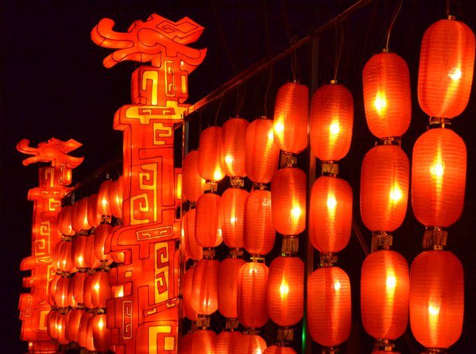
由上圖可以看出,頁面分為上(網站導航)、中、下(版權聲明)三個部分,
中間部分又分為左(商品分類)、中(主要部分)、右,這些版塊就像一個個
的盒子,這些 盒子 中放置著各種內容,頁面就是由這些 盒子 拼湊起來
案例布局分析:
![1376923543-5b46cf378eab4_articlex[1].jpg](http://img.VeVb.com//upload/image/871/742/343/1531469585501570.jpg "1531469585501570.jpg")
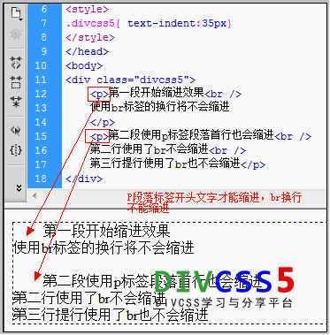
!doctype html html head meta charset= utf-8 / title 單列布局 /title /head style body{ margin:0; .box{ width:960px; margin:0 auto; .box .header{ height:120px; border:1px solid #f00; line-height:120px; .box .main{ height:300px; border:1px solid #0f0; line-height:300px; .box .footer{ height:100px; border:1px solid #00f; line-height:100px; text-align:center; /style body p >運行結果:雙列布局案例:代碼如下:
!doctype html html head meta charset= utf-8 / title 雙列布局 /title /head style body{ margin:0; .box{ width:80%; margin:0 auto; overflow:hidden; .box .left{ width:30%; height:400px; background-color:#0f0; float:left; .box .right{ width:70%; height:400px; background-color:#f00; float:left; /style body p >運行結果如下圖:三列布局案例:代碼如下:
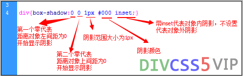
!doctype html html head meta charset= utf-8 / title 三列布局 /title /head style body{ margin:0; .box{ width:960px; margin:0 auto; position:relative; .box .left{ width:200px; height:400px; background-color:#0f0; position:absolute; .box .center{ height:400px; background-color:#00f; margin:0 300px 0 200px; .box .right{ width:300px; height:400px; background-color:#f00; position:absolute; right:0; top:0; /style body p >運行結果如下圖:混合布局案例:代碼如下:
!doctype html html head meta charset= utf-8 / title 混合布局 /title /head style body{ margin:0; .box{ width:960px; margin:0 auto; .header{ height:120px; background-color:#ddd; .main{ height:400px; background-color:#f00; position:relative; .main .left{ width:200px; height:400px; position:absolute; left:0; top:0; background-color:#0fccaa; .main .center{ height:400px; margin:0 305px 0 205px; background-color:#123456; .main .right{ width:300px; height:400px; position:absolute; right:0; top:0; background-color:#ff0; .footer{ height:80px; background-color:#ddd; /style body p >運行結果如下圖:
以上就是本文的全部內容,希望對大家的學習有所幫助,更多相關內容請關注PHP !
相關推薦:
詳解前端在html頁面之間傳遞參數的方法
html用表格布局來實現用戶注冊表單實例
以上就是HTML+CSS和DIV如何實現排版布局的詳細內容,html教程
鄭重聲明:本文版權歸原作者所有,轉載文章僅為傳播更多信息之目的,如作者信息標記有誤,請第一時間聯系我們修改或刪除,多謝。
新聞熱點


疑難解答
![4125081848-5b46d0aebc53f_articlex[1].png](http://img.VeVb.com//upload/image/397/587/984/1531469598789189.png "1531469598789189.png")
![644704244-5b46d3b9c6eac_articlex[1].png](http://img.VeVb.com//upload/image/253/241/916/1531469605477367.png "1531469605477367.png")
![301091421-5b46d50ad43e5_articlex[1].png](http://img.VeVb.com//upload/image/215/830/858/1531469612465577.png "1531469612465577.png")
![2619066118-5b46d5e7b3d8f_articlex[1].png](http://img.VeVb.com//upload/image/280/991/446/1531469627745767.png "1531469627745767.png")