在android開發中,除了自定義視圖的繪制外,復合控件也是一種常用的自定義視圖,它通過結合系統提供的一些公共視圖添加一些自定義屬性,下面是武林技術頻道小編介紹的Android中View自定義組合控件的基本編寫方法。
有很多情況下,我們只要運用好Android給我提供好的控件,經過布局巧妙的結合在一起,就是一個新的控件,我稱之為“自定義組合控件”。
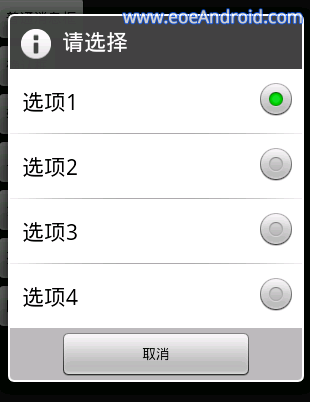
那么,這種自定義組合控件在什么情況下用呢?或者大家在做項目時候會發現,某些布局會被重復的利用,同一個布局的XML代碼塊會被重復的復制黏貼多次,這樣會造成代碼結構混亂不說,代碼量也會增大,各種控件都需要在Java代碼中被申明和處理相應的邏輯,工作量著實不小,所以,必須要找到一個合理的“偷懶”的方式,開動腦經去怎么簡化以上說的不必要的麻煩。下面看一張圖,就一個簡單的布局,我們就此圖來實現一個簡單的自定義組合控件。

從上面的圖來分析,我們可以看到,這個布局里面是沒有“全新”的控件的,用的都是Android系統原生的控件。熟悉Android界面布局的人,肯定覺得這種布局真是小Case,太簡單了,分分鐘就可以寫完。于是下面就是某一個條目的布局代碼:
<!--?xml version=1.0 encoding=utf-8?--><relativelayout android:background="@drawable/selector_blue" android:id="@+id/rl_show_address" android:layout_height="60dip" android:layout_width="match_parent" xmlns:android="http://schemas.android.com/apk/res/android"> <textview android:id="@+id/tv_title" android:layout_height="wrap_content" android:layout_marginleft="5dip" android:layout_margintop="1dip" android:layout_width="wrap_content" android:text="這是標題" android:textcolor="#000000" android:textsize="20sp"> <textview android:id="@+id/tv_desc" android:layout_below="@id/tv_title" android:layout_height="wrap_content" android:layout_marginleft="6dip" android:layout_margintop="1dip" android:layout_width="wrap_content" android:text="這是描述內容" android:textcolor="#99ff0000" android:textsize="14sp"> <checkbox android:clickable="false" android:focusable="false" android:id="@+id/cb_status" android:layout_alignparentright="true" android:layout_centervertical="true" android:layout_height="wrap_content" android:layout_width="wrap_content"> <!-- 加一條分割線 --> <view android:background="#000000/" android:layout_alignbottom="@id/cb_status" android:layout_alignparentbottom="true" android:layout_height="0.2dip" android:layout_margintop="7dip" android:layout_width="match_parent"> </view></checkbox></textview></textview></relativelayout>
可以看到,這種布局確實相當的簡單。但是,這時候產品經理告訴你,需求改了,我們需要在這個界面再加一個這樣的條目,于是你覺得,小意思,Ctrl+C,Ctrl+V,輕松搞定,然后改一下控件的id,在Java代碼中findviewbyid(id),加一段邏輯代碼,搞完收工。沒想到這時候產品又來了,需求改了,這里需要加10個這樣的布局,于是你...誠然,這時候再Ctrl+C,Ctrl+V是不合適的,工作量就顯得很大了,即使你不嫌麻煩的話,照樣做了,你料不到產品會再來,那個給我刪掉幾個,那個再加上幾個,是不是要瘋了。
?
也許,我們可以相出一個偷懶的方法來呢。通過分析上面的布局,可以發現,布局上每一個子條目是不變的,布局完全一樣,唯一在變化的是,紅色的TextView上的文本隨著CheckBox的狀態再改變著,而這種變化,我們是否可以想辦法抽取到某個方法中呢,答案是肯定能的。我們可以將這種子條目的布局一次性封裝到一個Java類中,每次調用這個控件的時候,事先設定各種屬性數據即可,這里涉及到了自定義屬性了。分析一下這個屬性集該怎么定義,從上面的圖片可以看出,控件上需要設置的內容分別是,上面TextView的標題,還有下面TextView的描述信息,且描述信息是根據CheckBox的狀態發生改變的,所以這兩種狀態(true或false)都需要被定義到屬性集里去,于是屬性集就有了。
在工程下的res/values目錄下,新建attrs.xml文件,定義如下屬性集:
<!--?xml version=1.0 encoding=utf-8?--><resources> <declare-styleable name="combinationView"> </attr> </attr> </attr> </declare-styleable> </resources>
定義好了屬性集了,接下來我們就需要定義一個Java類,來渲染這段布局,解析這個屬性集,并且對象提供修改控件狀態的方法,已達到復用的效果。問題來了,我們定義的這個Java類需要繼承哪個類呢?在這里,我們不必考慮View了,因為這里不是全新自定義控件,不需要onMessure和onDraw去測量去畫一個視圖。那么ViewGroup呢?我們也不必用這個類,因為這里的布局是給定好的,不需要使用onLayout給子控件設置顯示的位置。那么,該繼承什么呢?我們可以想象一下ViewGroup的子類是不是可以呢?實現自定義控件的除了繼承View和ViewGroup之外,還可以直接繼承Android已有的控件進行修改,這個用面向對象的思想,應該不難想象吧。由于,該布局文件用的相對布局RelativeLayout,我們想當然可以自定義Java類去繼承這個RelativeLayout,RelativeLayout里提供一些參數和方法方便我們去實現子控件的布局。但是,我們這里直接在子控件布局已經寫好了,不需要使用RelativeLayout提供的參數和方法來布局了。所以,導致了,即使不去繼承RelativeLayout,而改成LinearLayout,FrameLayout...也是可以的,只要這個布局類是ViewGroup的子類就行。以下是這個自定義組合控件的實現代碼:
package com.example.combinationview; import android.content.Context;import android.util.AttributeSet;import android.view.View;import android.widget.CheckBox;import android.widget.RelativeLayout;import android.widget.TextView; public class CombinationView extends RelativeLayout { private TextView tv_title; private TextView tv_desc; private CheckBox cb_status; // 命名空間,在引用這個自定義組件的時候,需要用到 private String namespace = http://schemas.android.com/apk/res/com.example.combinationview; // 標題 private String title; // 被選中的描述 private String desc_on; // 未被選中的描述 private String desc_off; public CombinationView(Context context, AttributeSet attrs) { super(context, attrs); // 將自定義組合控件的布局渲染成View View view = View.inflate(context, R.layout.layout_combinationview, this); tv_title = (TextView) view.findViewById(R.id.tv_title); tv_desc = (TextView) view.findViewById(R.id.tv_desc); cb_status = (CheckBox) view.findViewById(R.id.cb_status); title = attrs.getAttributeValue(namespace, title); desc_on = attrs.getAttributeValue(namespace, desc_on); desc_off = attrs.getAttributeValue(namespace, desc_off); System.out.println(title + : + desc_on + : + desc_off); // 初始化到子控件 if (title != null) { tv_title.setText(title); } if (desc_off != null) { tv_desc.setText(desc_off); } } /** * 判斷是否被選中 * * @return */ public boolean isChecked() { return cb_status.isChecked(); } /** * 設置選中的狀態 * * @param isChecked */ public void setChecked(boolean isChecked) { cb_status.setChecked(isChecked); if (isChecked) { tv_desc.setText(desc_on); } else { tv_desc.setText(desc_off); } } }代碼很簡單,首先繼承RelativeLayout,復寫其構造方法,在構造方法中先渲染布局的視圖,然后讀取屬性集的屬性,將默認顯示的屬性顯示到布局上的子控件上即可。另外,還要對外提供一個判斷狀態的方法isChecked()來判斷該控件是否被選中了,提供一個設置狀態的方法setChecked(boolean),用來改變狀態。PS:為了驗證我上面的一段話,讀者可以將繼承RelativeLayout,改為繼承LinearLayout或者繼承FrameLayout,運行試試看,也是可以實現的。
?
下面是引用這個自定義組合控件的方法,首先需要在Activity的布局文件中定義出來:
<linearlayout android:layout_height="match_parent" android:layout_width="match_parent" android:orientation="vertical" xmlns:android="http://schemas.android.com/apk/res/android" xmlns:example="http://schemas.android.com/apk/res/com.example.combinationview"> <com.example.combinationview.combinationview android:id="@+id/cv_first" android:layout_height="wrap_content" android:layout_width="match_parent" example:desc_off="我是未被選中的描述1" example:desc_on="我是被選中的描述1" example:title="我是標題1"> </com.example.combinationview.combinationview> <com.example.combinationview.combinationview android:id="@+id/cv_second" android:layout_height="wrap_content" android:layout_width="match_parent" example:desc_off="我是未被選中的描述2" example:desc_on="我是被選中的描述2" example:title="我是標題2"> </com.example.combinationview.combinationview> <com.example.combinationview.combinationview android:id="@+id/cv_third" android:layout_height="wrap_content" android:layout_width="match_parent" example:desc_off="我是未被選中的描述3" example:desc_on="我是被選中的描述3" example:title="我是標題3"> </com.example.combinationview.combinationview> <com.example.combinationview.combinationview android:id="@+id/cv_fourth" android:layout_height="wrap_content" android:layout_width="match_parent" example:desc_off="我是未被選中的描述4" example:desc_on="我是被選中的描述4" example:title="我是標題4"> </com.example.combinationview.combinationview> </linearlayout>
首先在上面定義了四個自定義組合控件,大家可以看到,代碼精簡多了不是?!需要注意的地方:這里引用了自定義的屬性集,所以在布局節點上必須要加上命名空間
xmlns:example=http://schemas.android.com/apk/res/com.example.combinationview
其中,example是命名空間的名稱,是任意取的,但是必須在控件中引用屬性的名稱一致,不然會報錯。后面的一串是標明屬性集的路徑,前半部分是固定的,最后一個“/”后面的內容必須是工程的包名,否則報錯。
?
下面是Activity里面的業務邏輯代碼,沒什么好說的
package com.example.combinationview; import android.os.Bundle;import android.view.View;import android.view.View.OnClickListener;import android.app.Activity; public class MainActivity extends Activity implements OnClickListener { private CombinationView cv_first; private CombinationView cv_second; private CombinationView cv_third; private CombinationView cv_fourth; @Override protected void onCreate(Bundle savedInstanceState) { super.onCreate(savedInstanceState); setContentView(R.layout.activity_main); cv_first = (CombinationView) findViewById(R.id.cv_first); cv_second = (CombinationView) findViewById(R.id.cv_second); cv_third = (CombinationView) findViewById(R.id.cv_third); cv_fourth = (CombinationView) findViewById(R.id.cv_fourth); cv_first.setOnClickListener(this); cv_second.setOnClickListener(this); cv_third.setOnClickListener(this); cv_fourth.setOnClickListener(this); } @Override public void onClick(View v) { switch (v.getId()) { case R.id.cv_first: if (cv_first.isChecked()) { cv_first.setChecked(false); } else { cv_first.setChecked(true); } break; case R.id.cv_second: if (cv_second.isChecked()) { cv_second.setChecked(false); } else { cv_second.setChecked(true); } break; case R.id.cv_third: if (cv_third.isChecked()) { cv_third.setChecked(false); } else { cv_third.setChecked(true); } break; case R.id.cv_fourth: if (cv_fourth.isChecked()) { cv_fourth.setChecked(false); } else { cv_fourth.setChecked(true); } break; default: break; } } }好了,關于自定義組合控件就講完了,非常簡單,但是比較常用。以后在項目用到時,想想實現步驟,自定義一種的組合的控件,用起來確實比較方便,比單純的復制黏貼不僅高大上,而且提高代碼的復用性,簡化了代碼的結構和減少了代碼量。
下面再來看這樣的一個完整的實例,比較簡單,直接上代碼了:
package com.xiong.demo1; import android.app.Activity; import android.os.Bundle; import android.view.View; public class MainActivity extends Activity { @Override protected void onCreate(Bundle savedInstanceState) { super.onCreate(savedInstanceState); setContentView(R.layout.main_activity); TitleBarView titleBarView = (TitleBarView) findViewById(R.id.tbar_test); titleBarView.getTextViewRigth().setVisibility(View.GONE); titleBarView.setTitleBarChangerLiseter(new ItitleOnChangeLister() { @Override public void setLeftOnClickLister() { finish(); } @Override public void setRigthOnClickLister() { } }); } } <?xml version="1.0" encoding="utf-8"?> <LinearLayout xmlns:android="http://schemas.android.com/apk/res/android" xmlns:xionglh="http://schemas.android.com/apk/res-auto" android:layout_width="match_parent" android:layout_height="match_parent"> <com.xiong.demo1.TitleBarView android:id="@+id/tbar_test" android:layout_width="match_parent" android:layout_height="45dp" xionglh:titleBar_center_text="首頁" xionglh:titleBar_center_textColor="@android:color/black" xionglh:titleBar_center_text_size="18sp" xionglh:titleBar_left_bg="@mipmap/left_back" xionglh:titleBar_right_text="安全中心" xionglh:titleBar_right_text_size="12sp"/> </LinearLayout>
<?xml version="1.0" encoding="utf-8"?> <resources> <declare-styleable name="TitleBar"> <attr name="titleBar_center_text_size" format="dimension"/> <attr name="titleBar_center_text" format="string"/> <attr name="titleBar_center_textColor" format="color"/> <attr name="titleBar_left_bg" format="reference"/> <attr name="titleBar_right_text_size" format="dimension"/> <attr name="titleBar_right_text" format="string"/> <attr name="titleBar_right_textColor" format="color"/> </declare-styleable> </resources>
package com.xiong.demo1; import android.content.Context; import android.content.res.TypedArray; import android.graphics.Color; import android.util.AttributeSet; import android.util.TypedValue; import android.view.View; import android.view.ViewGroup; import android.widget.ImageView; import android.widget.RelativeLayout; import android.widget.TextView; public class TitleBarView extends RelativeLayout { private ItitleOnChangeLister mItitleOnChangeLister; private ImageView mImgLeft; private TextView mTxtCenter, mTxtRigth; private float mTitleCenterTextSize;//標題字體大小 private String mTitleCenterText;//標題文字 private int mTitleCenterTextColor;//標題顏色 private int mLeftBg;//左邊返回按鈕 private float mTitleRigthTextSize;//標題字體大小 private String mTitleRigthText;//標題文字 private int mTitleRigthColor;//標題顏色 public TitleBarView(Context context, AttributeSet attrs) { super(context, attrs); int defualtSize = (int) TypedValue.applyDimension( TypedValue.COMPLEX_UNIT_SP, 16, getResources().getDisplayMetrics()); TypedArray typedArray = getContext().obtainStyledAttributes(attrs, R.styleable.TitleBar); mTitleCenterTextSize = typedArray.getDimension(R.styleable.TitleBar_titleBar_center_text_size, defualtSize); mTitleCenterText = typedArray.getString(R.styleable.TitleBar_titleBar_center_text); mTitleCenterTextColor = typedArray.getColor(R.styleable.TitleBar_titleBar_center_textColor, Color.RED); mLeftBg = typedArray.getResourceId(R.styleable.TitleBar_titleBar_left_bg, R.mipmap.left_back); mTitleRigthTextSize = typedArray.getDimension(R.styleable.TitleBar_titleBar_right_text_size, defualtSize); mTitleRigthText = typedArray.getString(R.styleable.TitleBar_titleBar_right_text); mTitleRigthColor = typedArray.getColor(R.styleable.TitleBar_titleBar_right_textColor, Color.RED); typedArray.recycle(); initView(); } private void initView() { mTxtCenter = new TextView(getContext()); mTxtCenter.setText(mTitleCenterText); mTxtCenter.setTextSize(TypedValue.COMPLEX_UNIT_PX, mTitleCenterTextSize); mTxtCenter.setTextColor(mTitleCenterTextColor); LayoutParams centerParams = new LayoutParams(ViewGroup.LayoutParams.WRAP_CONTENT, ViewGroup.LayoutParams.WRAP_CONTENT); centerParams.addRule(RelativeLayout.CENTER_IN_PARENT, TRUE); addView(mTxtCenter, centerParams); mTxtRigth = new TextView(getContext()); mTxtRigth.setText(mTitleRigthText); mTxtRigth.setTextSize(TypedValue.COMPLEX_UNIT_PX, mTitleRigthTextSize); mTxtRigth.setTextColor(mTitleRigthColor); LayoutParams rigthParams = new LayoutParams(ViewGroup.LayoutParams.WRAP_CONTENT, ViewGroup.LayoutParams.WRAP_CONTENT); rigthParams.addRule(RelativeLayout.ALIGN_PARENT_RIGHT, TRUE); rigthParams.addRule(RelativeLayout.CENTER_VERTICAL, TRUE); addView(mTxtRigth, rigthParams); mImgLeft = new ImageView(getContext()); mImgLeft.setImageResource(mLeftBg); LayoutParams leftParams = new LayoutParams(ViewGroup.LayoutParams.WRAP_CONTENT, ViewGroup.LayoutParams.WRAP_CONTENT); leftParams.setMargins(6, 0, 0, 0); leftParams.addRule(RelativeLayout.CENTER_VERTICAL, TRUE); addView(mImgLeft, leftParams); View view = new View(getContext()); view.setMinimumWidth(1); view.setBackgroundColor(getResources().getColor(R.color.gray_767676)); LayoutParams viewParams = new LayoutParams(ViewGroup.LayoutParams.WRAP_CONTENT, 1); viewParams.addRule(RelativeLayout.ALIGN_PARENT_BOTTOM); addView(view, viewParams); mImgLeft.setOnClickListener(new OnClickListener() { @Override public void onClick(View v) { mItitleOnChangeLister.setLeftOnClickLister(); } }); mTxtRigth.setOnClickListener(new OnClickListener() { @Override public void onClick(View v) { mItitleOnChangeLister.setRigthOnClickLister(); } }); } public void setTitleBarChangerLiseter(ItitleOnChangeLister ititleOnChangeLister) { this.mItitleOnChangeLister = ititleOnChangeLister; } public ImageView getLeftImage() { return mImgLeft; } public TextView getTextViewCenter() { return mTxtCenter; } public TextView getTextViewRigth() { return mTxtRigth; } } package com.xiong.demo1; public interface ItitleOnChangeLister { void setLeftOnClickLister(); void setRigthOnClickLister(); } 上文是武林技術頻道小編介紹的Android中View自定義組合控件的基本編寫方法,大家在進行軟件開發的時候,最好理性一點,選擇一些正規、有名氣的技術網站進行學習,這樣能讓我們在開發的時候減少不必要的麻煩。新聞熱點


疑難解答